- 1Key Takeaways
- 2What Is a Travel Agency Logo, and Why Does It Matter?
- 3What Makes Effective Travel Agency Logo Design?
- 4The 11 Best Travel Agency Logo Design Ideas for 2026
- 1. The Minimalist Wordmark
- 2. The Abstract Route-Line Mark
- 3. The Negative-Space Landmark
- 4. The Stamp & Seal Badge
- 5. The Compass Monogram
- 6. The Hand-Drawn Wanderlust Line Art
- 7. The Warm Gradient Horizon Mark
- 8. The Morph-Mark
- 9. The Luxury Emblem or Crest
- 10. The Bold Color-Block Icon
- 11. The Typography + Micro-Icon Combination Mark
- Quick Comparison: Travel Agency Logo Ideas by Style and Fit
- 5Why Is Minimalist Travel Agency Logo Design Trending in 2026?
- 6Travel Agency Logo Design: DIY Tools vs. Hiring a Designer
- 7How Much Does a Travel Agency Logo Cost?
- 8Common Travel Agency Logo Design Mistakes to Avoid
- 9How to Brief a Designer for Your Travel Agency Logo
- 10Travel Agency Logo Design Glossary
- 11How Your Logo Fits Into Your Larger Travel Agency Brand
- 12Key Takeaways Recap
- 13Frequently Asked Questions
- What makes a good travel agency logo?
- Is a minimalist travel agency logo better than a colorful one?
- How much should a new travel agency spend on a logo?
- Can I design my own travel agency logo?
- What file formats do I need for my travel agency logo?
- Should my travel agency logo include an airplane or globe icon?
- How often should a travel agency update its logo?
Travel Agency Logo: 11 Best Design Ideas to Stand Out in 2026
A great travel agency logo builds instant trust — explore 11 design ideas, real 2026 trends, and costs to help you pick or brief the right one.

<!-- SEO META BLOCK SEO Title: Travel Agency Logo: 11 Best Design Ideas to Stand Out in 2026 Focus Keyword: travel agency logo Secondary Keywords: travel agency logo ideas; travel agency logo design; minimalist travel agency logo URL Slug: /travel-agency-logo/ Meta Description: A great travel agency logo builds instant trust — explore 11 design ideas, real 2026 trends, and costs to help you pick or brief the right one. Category: Branding & Marketing Funnel Stage: TOFU/MOFU Author: TravelBoost Team Featured Image ALT: travel agency logo design ideas 2026 Publish Date: 2026-07-11 -->
Travel Agency Logo: 11 Best Design Ideas to Stand Out in 2026
The best travel agency logo in 2026 does one job well: it makes a stranger trust you in under a second. That's it. Not "look cool," not "win a design award" — trust, fast, at any size from a favicon to a suitcase tag. We pulled together eleven concrete travel agency logo design ideas, grounded in what's actually trending this year, plus the practical costs and tools you'll need to bring one to life. By the end, you'll have a shortlist you can either brief to a designer or start building yourself this week.
Key Takeaways
A strong travel agency logo should be legible at 16 pixels and at 16 feet — if it only works full-size on a screen, it isn't finished.
The eleven travel agency logo ideas below range from a clean wordmark to a hand-drawn wanderlust mark, so there's a fit for budget brands and luxury advisors alike.
Minimalist travel agency logo design remains one of the strongest 2026 directions, but it's now being paired with warmth — soft gradients, human touches, and storytelling icons — instead of sterile geometry.
DIY logo makers like Canva and Looka work fine for a first version; a freelance or agency designer is worth the cost once your brand needs to hold up across print, signage, and social.
Expect to spend anywhere from $0 to $2,500+ depending on whether you DIY, crowdsource, or commission custom travel agency logo design.
Your logo is one piece of a bigger brand system — pair it with a clear travel agency business plan and consistent visuals across your booking tools.
What Is a Travel Agency Logo, and Why Does It Matter?
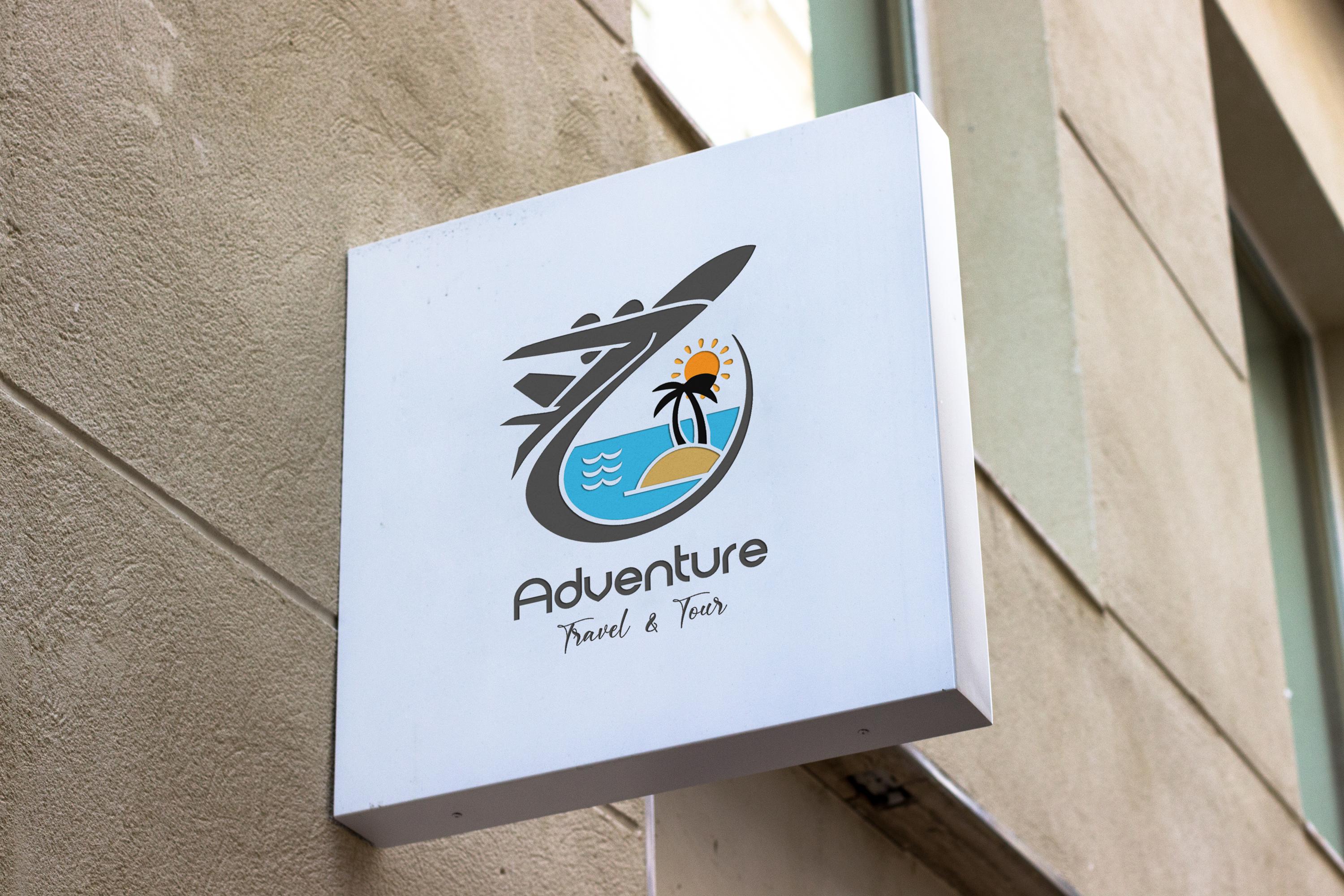
A travel agency logo is the visual mark — icon, wordmark, or combination of the two — that identifies your travel business across your website, invoices, email signature, social profiles, and marketing materials. It's usually the very first thing a prospective client sees, often before they've read a single word about what you offer.
That first-impression job matters more in travel than in most industries. Clients are handing over thousands of dollars and their vacation plans to someone they may have never met in person. A polished, professional travel agency logo signals competence and legitimacy before you've said a word — and a sloppy or generic one can quietly undercut trust, even if your service is excellent.
We've noticed that new advisors often treat the logo as an afterthought, something to slap together the night before the website launches. We'd push back on that. Your logo shows up everywhere: your Instagram avatar, your email footer, your business cards, your Zoom background during client calls. It's worth getting right early.
What Makes Effective Travel Agency Logo Design?
Effective travel agency logo design comes down to five qualities: simplicity, relevance, versatility, memorability, and timelessness. Before we get to specific concepts, it helps to know the basic logo types designers work with, since most of our eleven ideas below are built from these building blocks:
A wordmark is a logo built entirely from your business name in custom or stylized typography, with no separate icon (think: a clean, distinctive rendering of your agency's name).
A lettermark is a monogram-style logo built from initials rather than the full business name — useful for agencies with long or multi-word names.
A pictorial mark (or logomark) is an icon-only logo, like a standalone symbol, that's recognizable without any accompanying text once your brand is established.
An abstract mark is a geometric or non-literal symbol that represents your brand conceptually rather than depicting a real object.
A combination mark pairs an icon with your business name, giving you the flexibility to use the icon alone once it's recognizable and the full lock-up when introducing your brand.
An emblem is a badge- or seal-style logo where the text is contained inside a shape (a circle, shield, or crest), often used for a classic or established feel.
Most successful travel brands land on a combination mark: it gives you a standalone icon for a favicon or app tile, plus the full name for first impressions.
The 11 Best Travel Agency Logo Design Ideas for 2026
Here are eleven travel agency logo ideas we'd put in front of any new or rebranding agency this year, organized from the most minimal to the most expressive.
1. The Minimalist Wordmark
A clean, custom-set version of your agency name, no icon attached. This is the purest form of a minimalist travel agency logo — it relies entirely on typography choice, spacing, and maybe one subtle detail (a widened letterform, a custom ligature) to feel distinctive. It's the safest, most versatile option and it ages well.
Best for: Advisors who want a timeless, editorial feel — especially luxury or bespoke travel brands.
2. The Abstract Route-Line Mark
A single continuous line that suggests a flight path, road trip, or river route, often looping subtly into the shape of a letter from your business name. It communicates movement and journey without leaning on a literal airplane or globe icon.
Best for: Agencies branding around adventure, road trips, or custom itinerary planning.
3. The Negative-Space Landmark
A classic technique: hide a second image inside the first using empty space — a mountain range inside a plane's wing, a compass needle inside a letter "A." It rewards a second look and reads as clever rather than gimmicky when it's simple enough to still work in one color.
Best for: Brands wanting a distinctive icon with a memorable "aha" moment built in.
4. The Stamp & Seal Badge
Pulling from postmarks, passport stamps, and vintage travel ephemera, this style uses a circular or oval badge, a ringed border, arced text, and a slightly worn edge, often set in a single ink color. It's one of the clearest travel-specific trends for 2026, evoking nostalgia and tangible journeys in an otherwise digital-first world.
Best for: Agencies leaning into an adventurous, well-traveled, "we've been everywhere" brand story.
5. The Compass Monogram
Your initials arranged inside — or built from — a compass rose or directional needle. It's a lettermark with just enough travel symbolism to be unmistakably on-brand, without resorting to an overused globe icon.
Best for: Solo advisors or boutique agencies building a personal-name brand.
6. The Hand-Drawn Wanderlust Line Art
Loose, organic linework — a sketched palm leaf, a freehand mountain silhouette, a slightly imperfect script — that feels tactile and human rather than machine-generated. This direction leans directly into the 2026 shift toward warmth and "beautiful imperfection" as a reaction to AI-generated sameness.
Best for: Agencies specializing in experiential, off-the-beaten-path, or wellness-focused travel.
7. The Warm Gradient Horizon Mark
A simple horizon, sun, or arc rendered in a soft gradient — think warm coral fading into gold, or dusk blue into lilac — paired with clean sans-serif type. Warm gradients and soft iconography are among the most consistently cited travel agency logo design trends for 2026, replacing the harsher, flatter gradients of a few years ago.
Best for: Leisure and vacation-focused agencies wanting an inviting, optimistic feel.
8. The Morph-Mark
A flexible icon designed to shift slightly across contexts — a simplified version for a favicon, a fuller version for a website header, a subtle animation for social — while staying recognizably the same mark. This "dynamic identity" approach reflects how much of a modern travel brand actually lives in motion, across apps and video before it ever appears in print.
Best for: Digitally native agencies with a strong Instagram, TikTok, or app presence.
9. The Luxury Emblem or Crest
A more traditional badge or crest treatment — sometimes with a subtle crown, laurel, or flourish — built for agencies positioning themselves at the premium end of the market. Done well, it signals heritage and exclusivity; done poorly, it can feel dated, so restraint is essential here.
Best for: High-end, concierge-style, or destination-wedding-focused agencies.
10. The Bold Color-Block Icon
A simple geometric icon — a suitcase, sun, or plane silhouette — rendered in one or two saturated, high-contrast colors with no gradient or texture. This is the opposite instinct from a minimalist travel agency logo, and it works well for agencies targeting a younger, budget-conscious, or family travel audience where energy and approachability matter more than subtlety.
Best for: Family travel, group travel, or budget-friendly leisure brands.
11. The Typography + Micro-Icon Combination Mark
Your agency name set in strong custom type, with one small, simple icon integrated directly into a letterform rather than sitting beside it — a tiny plane replacing the dot on an "i," for example. It reads as a full wordmark first and rewards a closer look second, which makes it one of the more flexible combination marks on this list.
Best for: Agencies wanting a combination mark that still reads clean and minimal at small sizes.
Quick Comparison: Travel Agency Logo Ideas by Style and Fit
Logo Idea | Logo Type | Best For | Complexity to Design |
|---|---|---|---|
Minimalist Wordmark | Wordmark | Luxury, editorial brands | Low |
Abstract Route-Line Mark | Abstract mark | Adventure, road-trip brands | Medium |
Negative-Space Landmark | Pictorial mark | Distinctive standalone icon | High |
Stamp & Seal Badge | Emblem | Adventurous, nostalgic brands | Medium |
Compass Monogram | Lettermark | Solo advisors, boutiques | Medium |
Hand-Drawn Wanderlust | Pictorial mark | Experiential, wellness travel | Medium |
Warm Gradient Horizon | Combination mark | Leisure, vacation brands | Low–Medium |
Morph-Mark | Pictorial mark (dynamic) | Digitally native agencies | High |
Luxury Emblem/Crest | Emblem | Premium, concierge brands | Medium–High |
Bold Color-Block Icon | Pictorial mark | Family, budget, group travel | Low |
Typography + Micro-Icon | Combination mark | Clean, flexible branding | Medium |
Why Is Minimalist Travel Agency Logo Design Trending in 2026?
Minimalist travel agency logo design continues to trend because it performs better across the huge range of sizes and surfaces a modern brand actually needs to cover — from a 16-pixel favicon to a billboard — without losing legibility.
What's changed for 2026 is the why behind the minimalism. A few years ago, minimalist logos leaned cold and corporate: thin lines, flat grey palettes, geometric perfection. This year's version of a minimalist travel agency logo pairs that same simplicity with warmth — soft curves, human touches, and a story behind the mark — because brands are competing for emotional connection, not just clarity, in crowded digital feeds. In practice, that means a minimalist mark today is more likely to use a warm color, a slightly imperfect line, or a personal detail than the sterile, purely geometric marks that defined the style a decade ago.
If you're choosing between a minimalist and a more expressive direction, ask what your clients are booking. Minimalist reads as trustworthy and premium; a bolder, more colorful mark reads as fun and approachable. Neither is objectively better — they're built for different clients.
Travel Agency Logo Design: DIY Tools vs. Hiring a Designer
Whether to DIY your travel agency logo design or hire a designer comes down to budget, timeline, and how long you expect to keep the mark once you launch it.
Option | Typical Cost | Turnaround | Best For |
|---|---|---|---|
DIY logo maker (e.g., Canva, Design.com) | Free–$50 | Same day | Testing a brand concept, tight launch budgets |
AI logo generator (e.g., Looka) | $20–$100 | Minutes | Fast first drafts, non-designers |
Freelance marketplace (e.g., Fiverr) | $50–$500 | 2–7 days | A custom look on a moderate budget |
Crowdsourced design contest (e.g., 99designs) | $300–$1,300+ | 1–2 weeks | Multiple concepts to choose from |
Freelance or boutique designer | $500–$2,500+ | 2–6 weeks | A fully custom, strategy-backed identity |
We generally recommend new agencies start with a DIY or AI-generated version to launch quickly, then reinvest in a custom designer once revenue supports it and the brand is proven enough to be worth locking in for the long term.
How Much Does a Travel Agency Logo Cost?
A travel agency logo typically costs between $0 and $2,500+, depending on whether you build it yourself with a free tool, generate it with AI, crowdsource concepts, or commission a professional designer.
$0–$50: Free tiers of DIY logo makers, often watermarked or limited in file formats until you upgrade.
$50–$300: Paid DIY tools, AI generators, or a basic freelance package with a couple of revisions.
$300–$1,300: Crowdsourced design contests offering multiple concepts from different designers.
$1,300–$2,500+: A custom identity from an experienced freelance or boutique branding studio, typically including brand guidelines and multiple file formats.
Whatever you spend, make sure the final deliverable includes an editable vector file (SVG or AI/EPS), not just a PNG — you'll need it for everything from business cards to large-format signage down the road.
Common Travel Agency Logo Design Mistakes to Avoid
We see the same handful of mistakes across new agency logos, regardless of budget:
Using a cliché icon with no twist. A plain globe, generic location pin, or stock airplane silhouette blends into hundreds of other travel logos.
Designing only for a large screen. A mark that looks great as a huge website header can turn into an unreadable smudge as a 16-pixel favicon.
Choosing too many colors. Most strong travel agency logos use two or three colors at most; more than that gets expensive to reproduce and harder to remember.
Skipping a trademark search. Before you commit, run a quick search on the USPTO's trademark database to make sure your mark and name aren't already in use.
Never getting a monochrome version. You'll eventually need your logo in pure black and pure white for stamps, engraving, or single-color printing — build that version early rather than scrambling later.
Rushing the review with only one stakeholder. We recommend showing a shortlist of concepts to a few clients or colleagues before locking in a direction — a logo you love in isolation can land very differently with the audience it's actually meant to persuade.
How to Brief a Designer for Your Travel Agency Logo
Whichever route you choose — DIY, AI, crowdsourced, or custom — the quality of what comes back depends heavily on the brief you give upfront. We always tell agencies to answer these questions before reaching out to a designer or opening a logo maker, because a vague brief is the single biggest reason people end up with a generic-looking mark:
Brief Element | Question to Answer |
|---|---|
Niche | What kind of travel do you sell — luxury, adventure, family, corporate, cruises? |
Audience | Who's the client picturing your logo — a 28-year-old backpacker or a 55-year-old anniversary traveler? |
Personality | Three words that describe the brand feel (e.g., "warm, confident, unfussy") |
Competitors | Which agency logos do you not want to resemble, and why? |
Must-haves | Any name, initials, or symbol that has to be included |
Must-avoids | Colors, icons, or styles that feel off-brand or overused |
Usage | Where will the logo live — website only, or also signage, print, merchandise? |
According to VistaPrint's 2026 logo design trend research, the strongest small-business logos this year come from owners who pick "one or two choices that only your business would make" rather than chasing every trend at once — which is exactly what a tight, specific brief is designed to produce. We'd rather see an agency hand a designer three clear sentences about who they serve than a Pinterest board of fifty unrelated logos.
Travel Agency Logo Design Glossary
A few more terms worth knowing as you brief a designer or evaluate options:
Color palette is the specific, limited set of colors — usually two to four — that your logo and broader brand consistently use across every touchpoint.
Typography (or typeface) is the specific font or custom letterforms used in your logo and brand materials; it carries as much personality as any icon.
Vector file is a resolution-independent file format (like SVG, AI, or EPS) that lets your logo scale to any size — from a favicon to a billboard — without losing quality.
Favicon is the small icon version of your logo that appears in a browser tab, bookmarks bar, and search results.
Brand guidelines is a short document specifying your logo's approved colors, spacing, minimum size, and incorrect usage examples, so your mark stays consistent as your team or vendors grow.
Tagline is a short phrase, usually three to seven words, placed beneath or beside a logo to reinforce what the brand stands for.
Monochrome version is a single-color (usually solid black or solid white) version of a logo, required for uses where full color isn't possible, like engraving or a single-color stamp.
Negative space is the empty area around or within a logo's shapes — sometimes deliberately used to hide a second image, as in idea #3 above.
How Your Logo Fits Into Your Larger Travel Agency Brand
A great travel agency logo is only one piece of a larger brand system, and it's worth building it in the right order. If you're still working through the fundamentals of your business, our guide on how to start a travel agency from home walks through the full sequence — including where branding fits relative to accreditation and your host agency decision. It also helps to budget for design work as part of your broader travel agency startup costs, rather than treating it as a surprise expense after everything else is funded.
Once your logo is finalized, consistency matters more than perfection: the same mark, colors, and type should show up on your website, your email signature, your invoices, and inside whatever travel agency software you use to manage clients day to day. A logo that only appears on your homepage and nowhere else in the client experience doesn't do nearly as much work as one woven consistently through every touchpoint.
Key Takeaways Recap
A travel agency logo needs to work at every size, from a 16-pixel favicon to a printed banner — legibility first, aesthetics second.
Our eleven travel agency logo ideas span minimalist wordmarks, nostalgic stamp badges, warm gradients, and bold color-block icons, so there's a direction for almost any brand personality.
A minimalist travel agency logo remains one of the strongest 2026 directions, now paired with warmth and human detail rather than cold geometry.
Travel agency logo design costs range from free DIY tools to $2,500+ for a fully custom identity — pick based on your timeline and how long you expect to keep the mark.
Always request a vector file and a monochrome version, and run a quick trademark search before you commit to a final mark.
Frequently Asked Questions
What makes a good travel agency logo?
A good travel agency logo is simple enough to read at small sizes, relevant to what the agency actually sells, and distinctive enough to stand apart from the many travel logos built around generic globe, pin, or plane icons.
Is a minimalist travel agency logo better than a colorful one?
Neither is objectively better — a minimalist travel agency logo tends to read as premium and trustworthy, while a bolder, more colorful mark reads as energetic and approachable, so the right choice depends on the clients you're trying to attract.
How much should a new travel agency spend on a logo?
Most new travel agencies can launch confidently with a $0–$300 DIY or AI-generated logo, then reinvest in a $500–$2,500+ custom design once the business has steady revenue and a proven brand direction worth locking in.
Can I design my own travel agency logo?
Yes, tools like Canva, Design.com, and Looka let non-designers build a professional-looking travel agency logo in a single session, though a freelance or boutique designer is worth considering once your brand needs to hold up across many formats and years.
What file formats do I need for my travel agency logo?
At minimum, request a vector file (SVG or AI/EPS) for scalable use, a high-resolution PNG with a transparent background for digital use, and a monochrome version for single-color applications like stamps or engraving.
Should my travel agency logo include an airplane or globe icon?
Not necessarily — plane and globe icons are so common in travel branding that they can make a new agency blend in rather than stand out; an abstract mark, monogram, or typography-driven design often creates more distinctiveness.
How often should a travel agency update its logo?
Most travel agencies can keep the same logo for five to ten years if it was well-designed from the start; a refresh makes sense after a major rebrand, a shift in target clientele, or when the current mark no longer reflects the business.
Want a CRM that's actually built for travel?
Leads, bookings, suppliers, Hajj operations, tours, car rental, finance — all in one platform. Set up in 10 minutes.
Start free 14-day trialWeekly playbook for travel-agency operators
One email a week — product updates, benchmarks, and behind-the-scenes changelog. No spam.